
Define:
Tasked with exploring the correlations between self-collected data sets using visual analysis to uncover patterns and connections, creating rich and appealing data visualizations. I wanted to find out if my consistent productivity and goal achievement throughout my daily life was affecting my emotional well being and self esteem.
Data points tracked:
Productivity and personal goals:
- Each goal achieved
- How the achievements made me feel
- How significantly each goal impacted my mental and physical stress levels
- Any challenges I faced throughout the day
- My top priorities for the following day in order from most important to least important
- My self-assessed daily achievement score
Sleep tracking:
- Amount of time spent asleep throughout each night
- Amount of time spent awake before falling asleep
- REM sleep (in time & percentage)
- Core sleep (in time & percentage)
- Deep sleep (in time & percentage)
- Any naps prior
- If I met my 8 hour goal
- If I had any awakening feelings
- If I had any dreams
- Heart rate (beats per minute)
- Respiratory rate (breaths per minute)
(Did not follow through using sleep tracking data)
Methods:
The method I used for my productivity and personal goals was a daily reflection log where I tracked and manually entered the information into my notes app. The method I used for my sleep tracking was my Apple Watch through the Health app.
Timeline:
For my productivity and goal achievement, I mostly wrote small notes about what I was achieving throughout the day when they would happen. After the day was over, I would reflect upon and describe my achievements before I went to sleep and make notes on what was important. For my sleep tracking data, my Apple Watch collected all of my information for me while I was asleep throughout each night.
Initial observations of data findings:
Most of the consistency within my productivity and goal achievement data came from the similarities between the types of goals. Assignments became consistent with one another based on what I needed to get done for each class, which was caused by patterns of due dates. My personal goals aligned with one another as well because they consisted of chores that needed done more than once weekly, like doing laundry or cleaning my room. Social goals varied because I would always see a wide range of people weekly and only specific people on specific days.
Tools and techniques used:
I used Adobe Illustrator to construct my project. A technique I used for analyzing my productivity and goal achievement data was to list out everything that I'd achieved throughout the two weeks and organize the data by goal category (personal, social, and school), my daily achievement scores, and the words for how I felt about each goal achieved. This was an efficient way to organize and analyze a wide range of data.
Key findings from my analysis:
- I set goals for myself so I can feel fulfilled by achievements
- I take care of myself by setting goals and achieving them
- I hold standards for myself
- I hold myself accountable
- I achieve every goal that I set out for myself, it's just a matter of when
- I don't often miss due dates
- I work extremely hard
- I take care of myself by setting goals and achieving them
- I hold standards for myself
- I hold myself accountable
- I achieve every goal that I set out for myself, it's just a matter of when
- I don't often miss due dates
- I work extremely hard
Concept development:
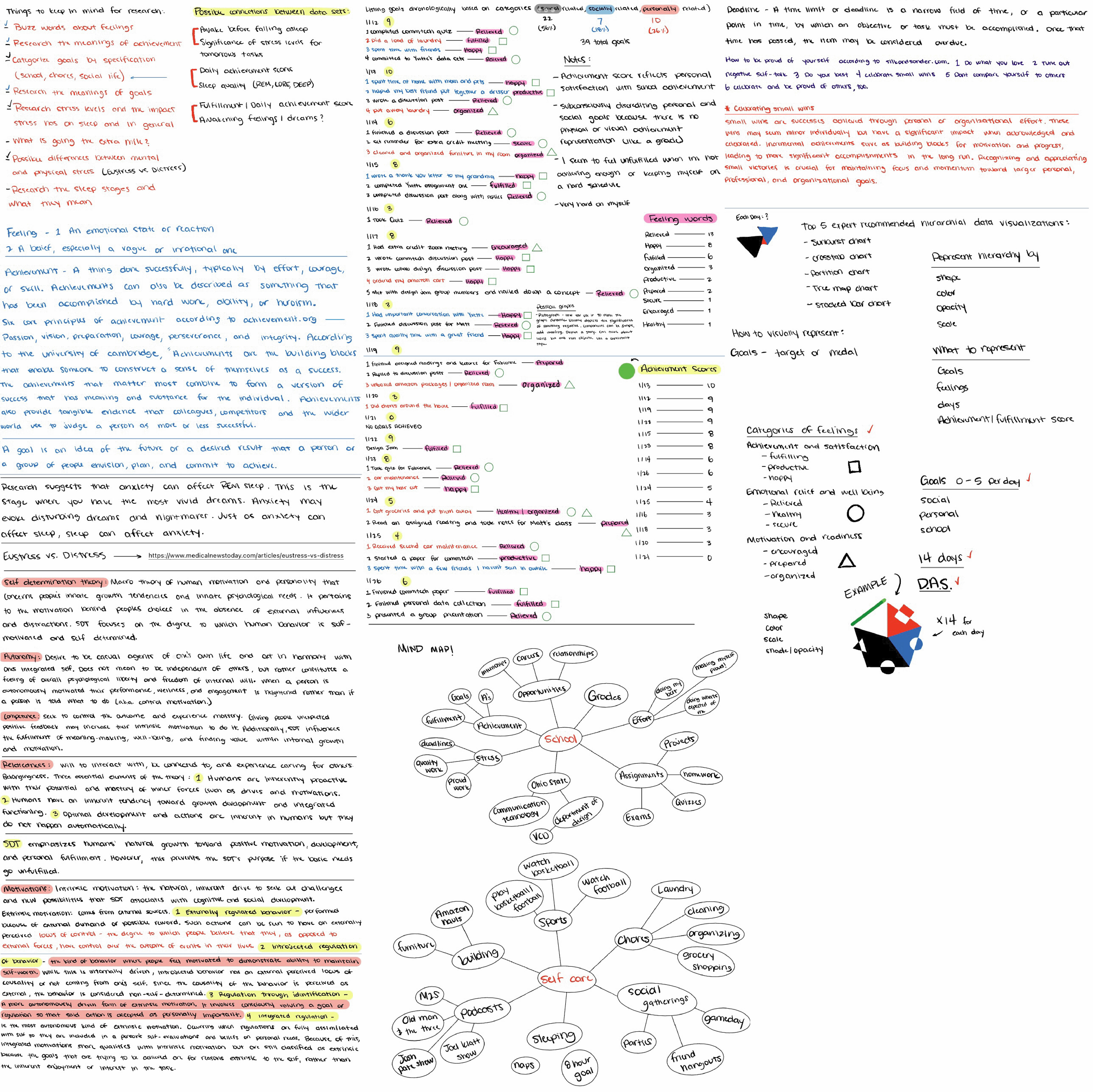
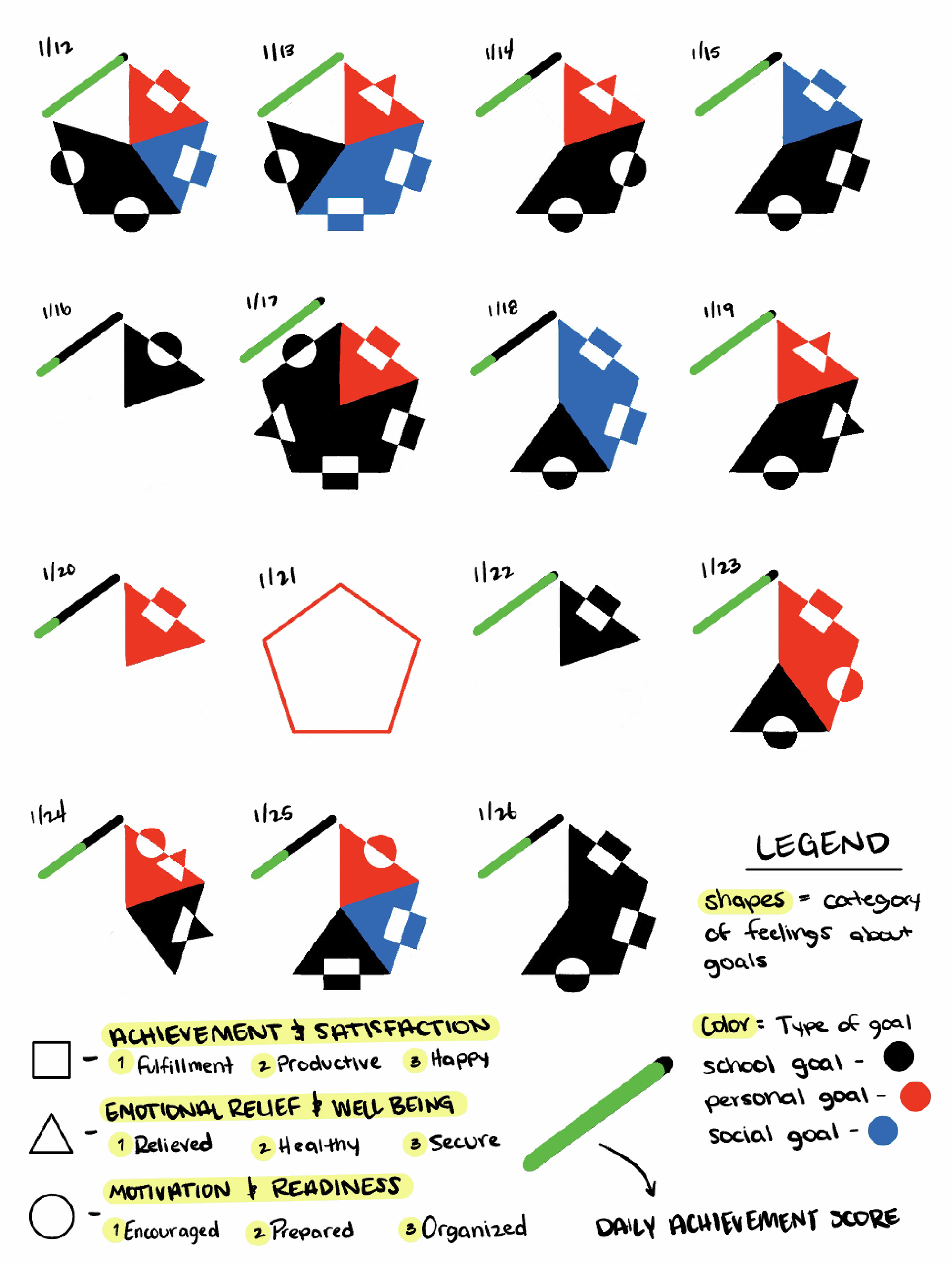
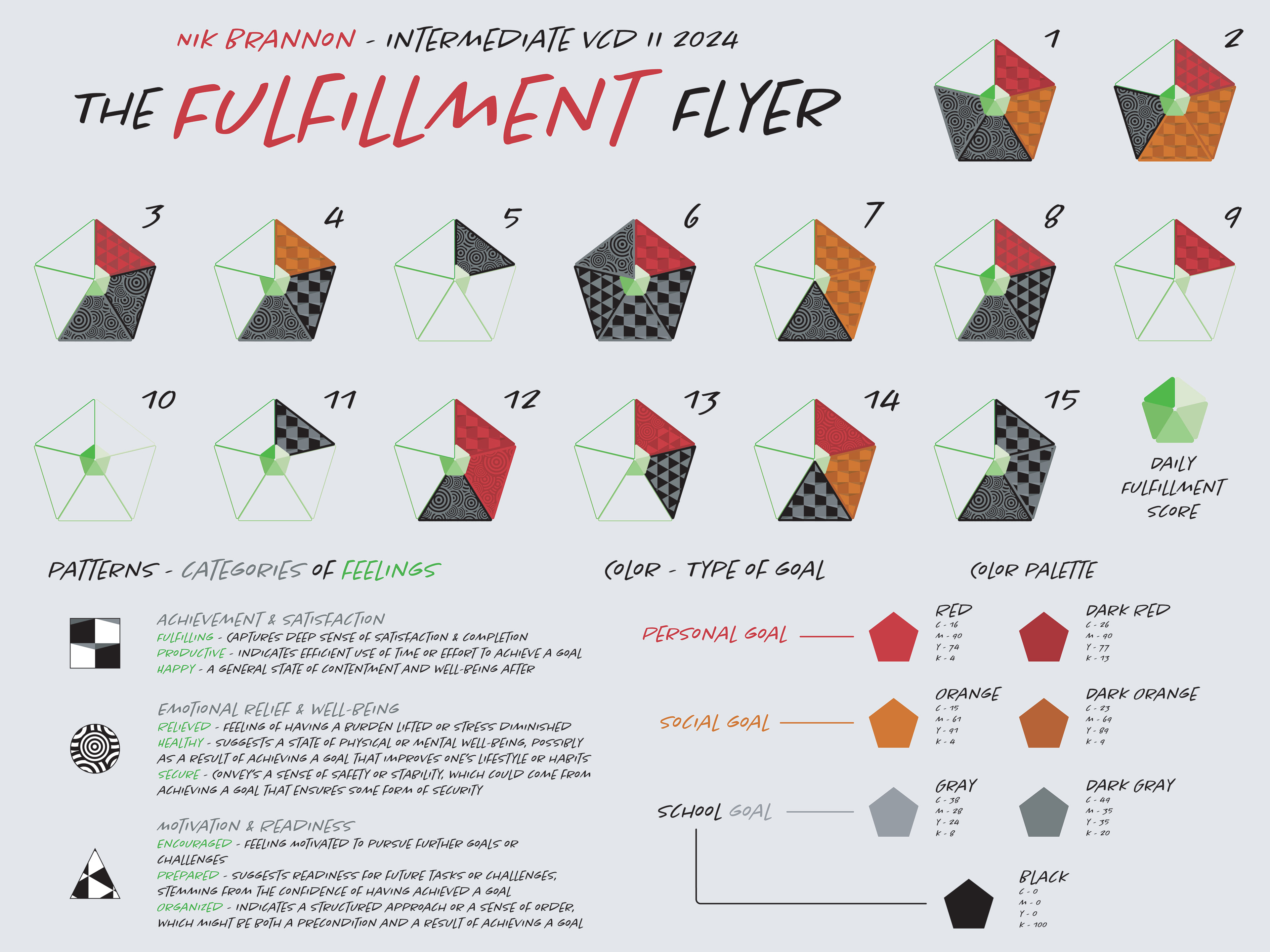
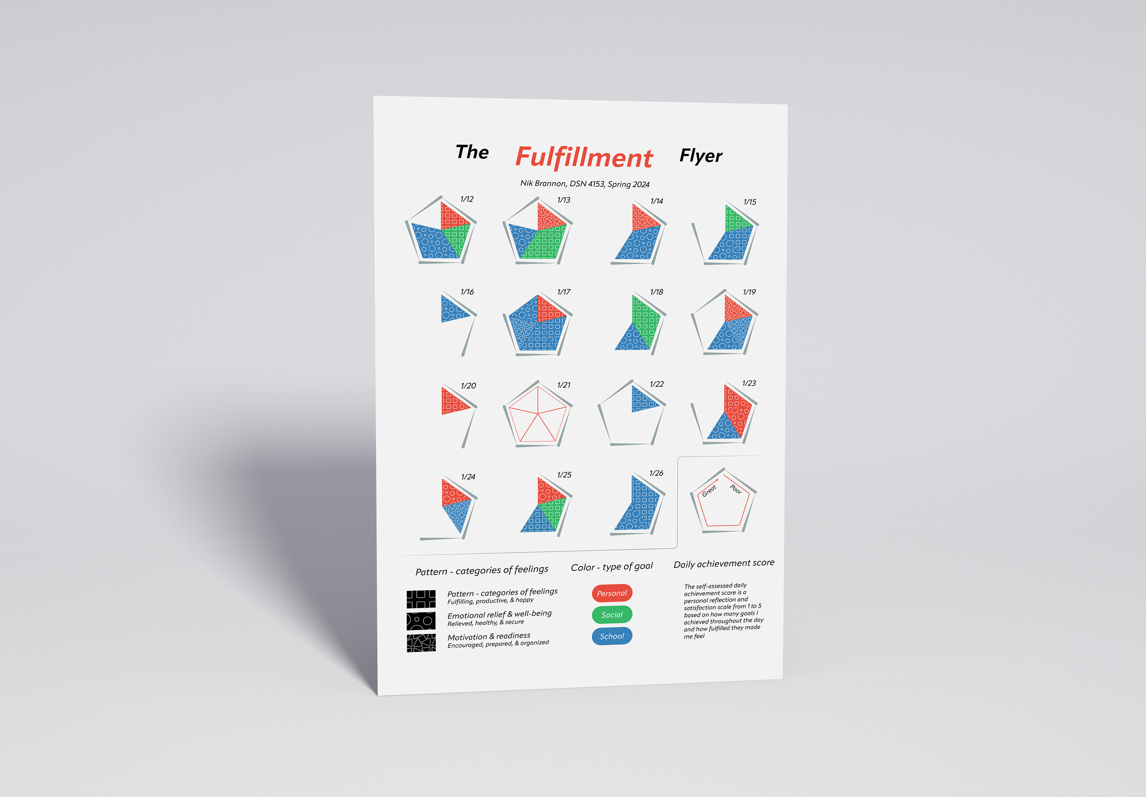
- Daily achievement score (satisfaction scale from 1 being the least satisfied, to 5 being the most satisfied by the goal achieved).
- I used a pentagon shape because there was not a day within my data where I reached more than 5 goals.
- I organized my personal feelings from the data into categories of feelings that emphasize emotional well-being, personal development, and preparedness for future opportunities.
- I used a pentagon shape because there was not a day within my data where I reached more than 5 goals.
- I organized my personal feelings from the data into categories of feelings that emphasize emotional well-being, personal development, and preparedness for future opportunities.
Sketches and drafts:
Pentagon iterations
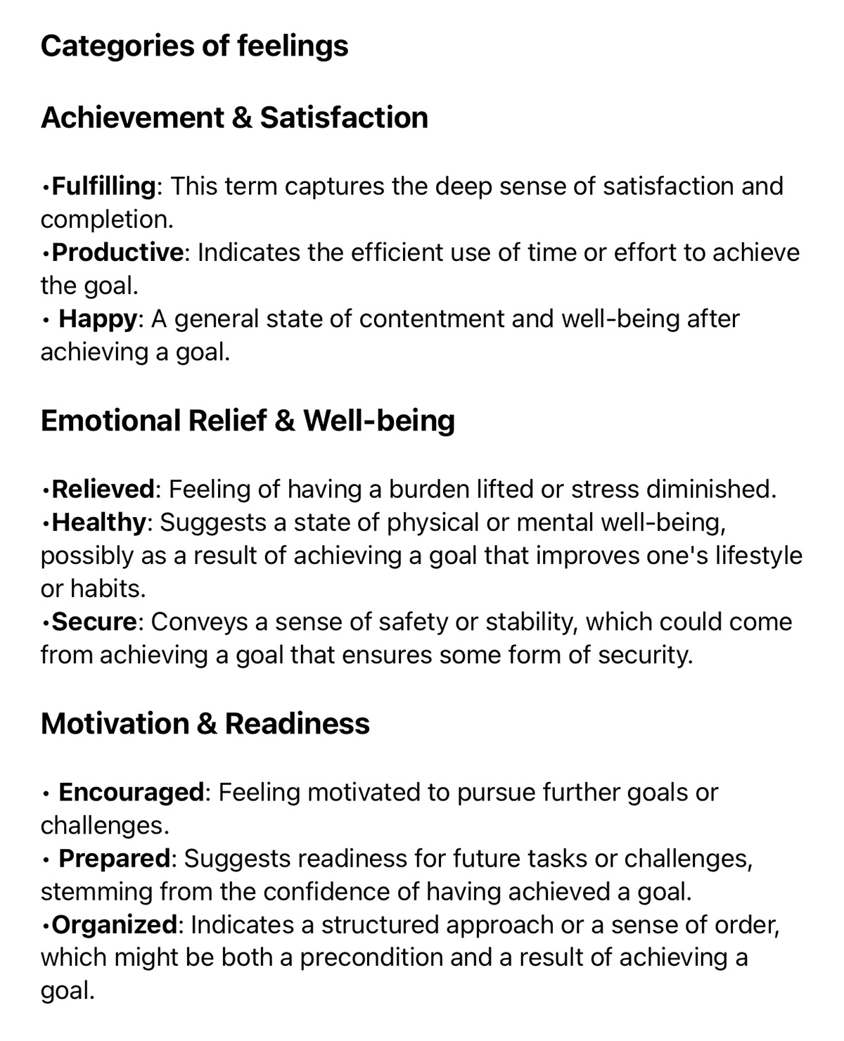
Categories of feelings
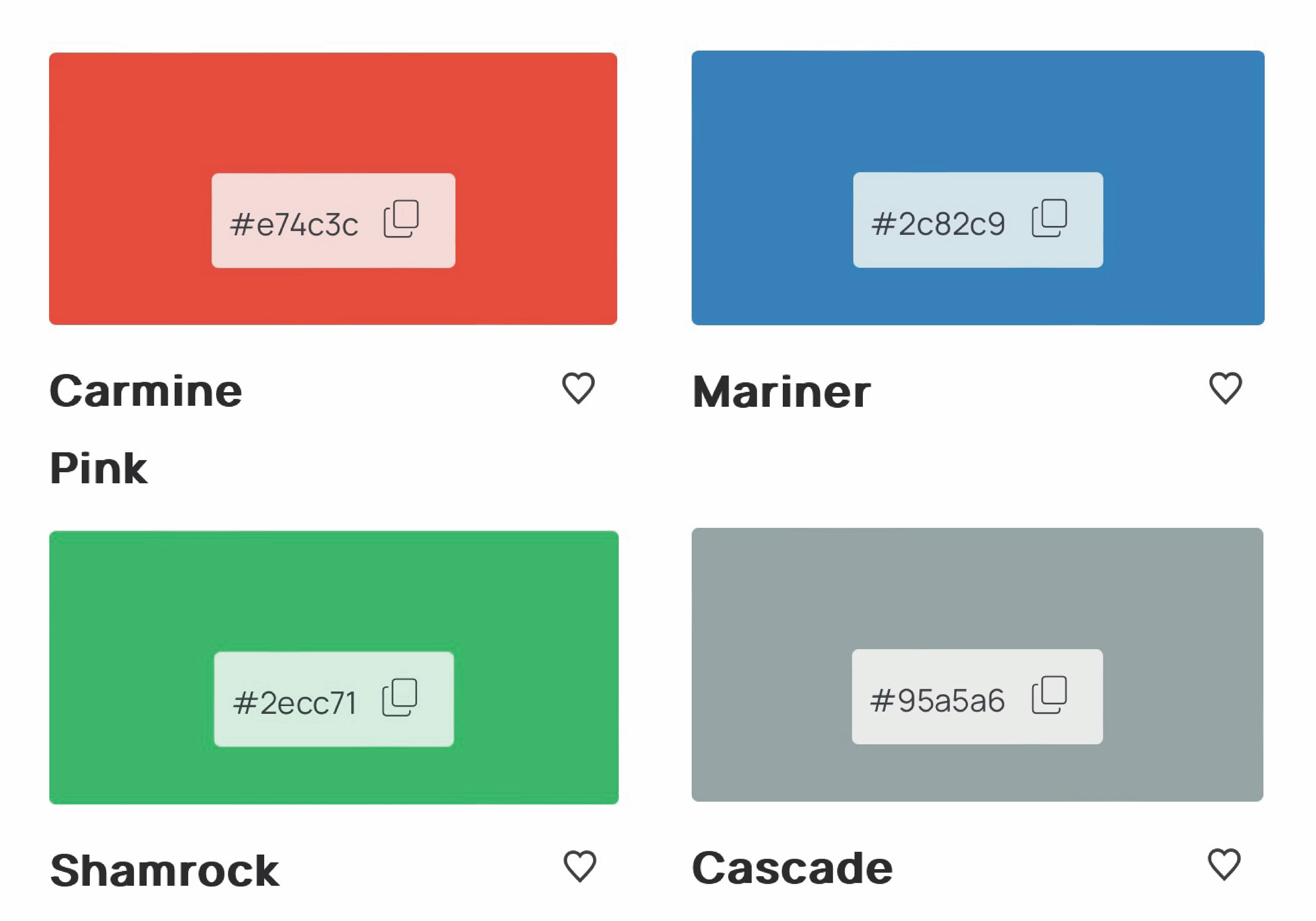
Color palette
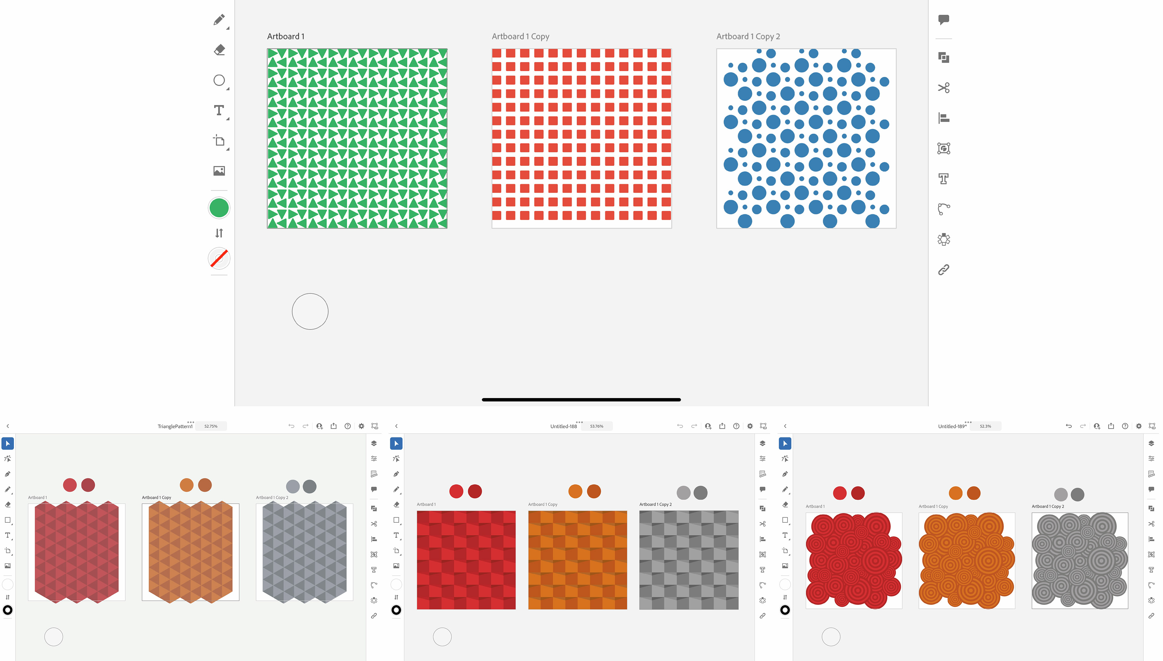
Pattern iterations
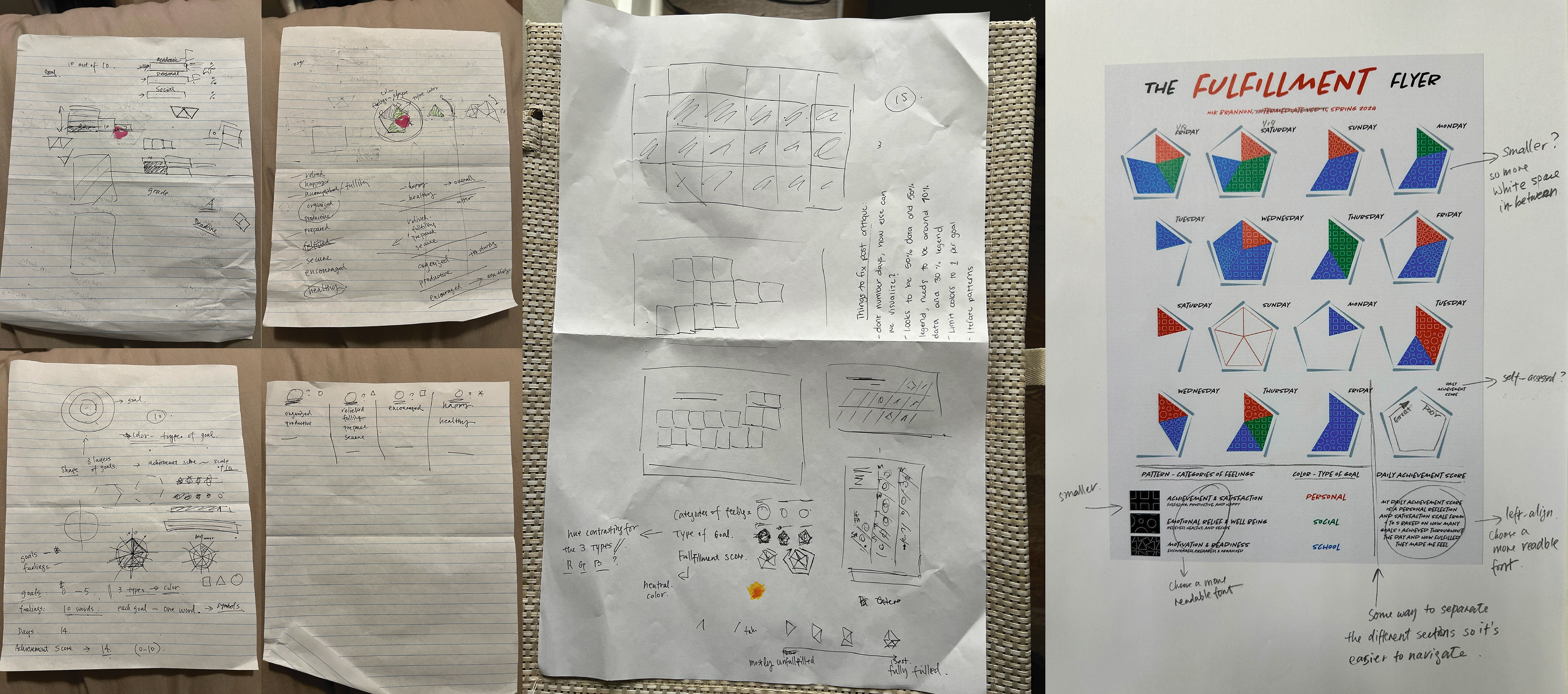
Critiques
Draft 1
Draft 2

Draft 3
Iteration process:
- I iterated and brainstormed multiple different shape patterns
- I made multiple visual representations of the daily achievement score
- I made a few color changes along the process to emphasize vibrance and energy
- I iterated the way the days of the week were spelled or written
- I organized content on the poster by scale and hierarchy
- I made multiple visual representations of the daily achievement score
- I made a few color changes along the process to emphasize vibrance and energy
- I iterated the way the days of the week were spelled or written
- I organized content on the poster by scale and hierarchy
These changes were all necessary to bring the composition to the next level.
Final design:
My final design incorporates all of the valuable information from my productivity and goal achievement data into neatly organized and visually pleasing pentagons. Each pentagon represents a full day. With each full day comes a certain number of goals that I achieved along with the color of each that represents the kind of goal I achieved. Each pattern represents one of three categories of personal feelings towards each goal achieved. Lastly, the daily achievement score is a reflection scale between 1 being the least satisfied and 5 being the most satisfied with the goals that I achieved throughout the day.

Final Draft
Mockup
Challenges faced:
- Finding a correlation or relationship between two chosen data sets
- Deciding which visual elements were going to represent which data points
- Deciding which visual elements were going to represent which data points
What did I learn?
One of the main takeaways or things that I've learned throughout this process was how to represent data visually. We discussed many things in class that had to do with how we organize different data, how easy we make the data appear to our viewers, and how we can effectively communicate data sets. I feel like I reflected a lot on the information that I learned over the course of the project and applied those things into my composition. I feel like I represented all of my data in a really efficient way that was easy to follow and comprehend. I am proud of my process and the final outcome that came to be.